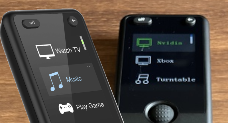
The font for the UI that you use for all of your marketing is NOWHERE NEAR what is on the actual display.
While this doesn't affect usability, it's a bit of a shock when you first get the device in person since the font (right) makes the UI feel very dated compared to the marketing (left).